To help your brand stand out with the right colour scheme, this complete guide covers everything from what brand colours are all about, to a clear process for choosing your own.
They say first impressions count. This is especially true when it comes to your brand because the colour of your logo is likely to be the first thing that people see. Colours evoke emotions and sentiments, as well as transmit information. Customers might develop an early opinion of your goods without even understanding what it is about. Simply said, brand colours have a significant impact on whether or not people want to engage.
It’s true that how consumers feel about a brand has more pull than what they think about a brand. When you combine that with the fact that particular colours elicit specific emotions, your brand colours have the power to influence your sales or performance even more than the things you sell. Given enough exposure, colours become part of a brand, so you want to encourage this association by using your brand colours consistently.
- Logo
- Website
- Storefront
- In-store design
- Staff Uniforms
- Advertisements
When you use the same colours in all of your business ventures, you reinforce your brand’s relationship with those colours and, as a result, brand recognition as a whole.
What this means, at least in terms of branding, is that you must carefully select your branding colours, since they will have a direct impact on your brand identity. Pink might be your favourite colour, but it may be bad for your company objectives. But before you pick the colours to represent you, you must first determine your ideal brand personality.
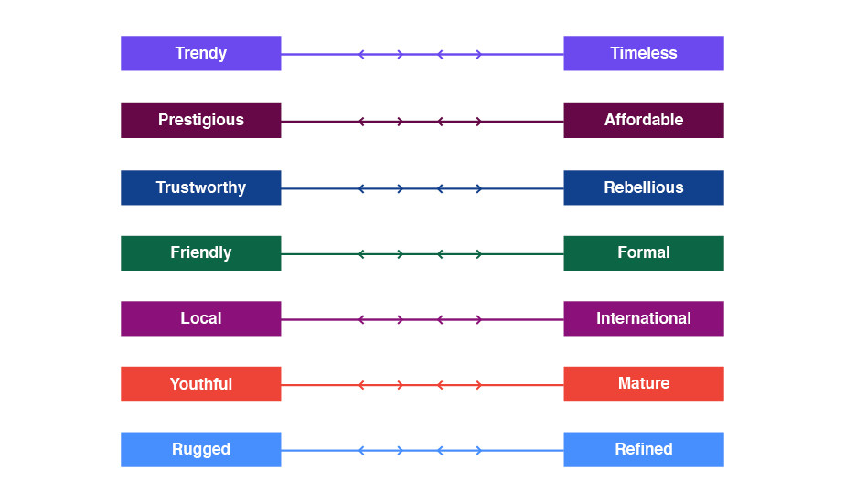
First and foremost, you need to define your brand identity. For this, it’s a good idea to make a list of adjectives that characterize your company’s personality as if you were talking about a person. Consider how you want your brand to be seen and what makes it stand out from the competitors.
The following spectrum of brand identity characteristics can become useful for establishing brand associations and can assist you in determining your brand’s core:
Choosing your branding colours is easy if you know what you’re trying to communicate. Once you established what your brand personality goals are, how do you determine which colours will work best? It starts with first learning the emotional associations of each colour.
-
-
- Red – Red is the colour of passion, excitement, and anger. It has the ability to convey importance and demand attention.
- Orange – Orange is a colour that represents fun, vibrancy, and friendliness. It is energizing and exciting.
- Yellow – Yellow inspires happiness, youth, and optimism, yet it may also appear attention-getting or inexpensive.
- Green – Green conveys stability, wealth, development, and a sense of being connected to nature.
- Light Blue – A light shade of blue evokes feelings of calm, trust, and openness. It can also be used to denote innocence.
- Dark Blue – Professionalism, security, and formality are all represented by dark blue. It is mature and reliable.
- Purple – Purple is a colour associated with monarchy, creativity, and luxury.
- Pink – Pink symbolises femininity, youth, and innocence. It spans from contemporary to luxurious.
- Brown – Brown has a rustic, earthy, vintage aspect or mood.
- White – White conjures us images of purity, morality, health, and simplicity. It can range from affordable to high-end.
- Grey – Grey is the colour of neutrality. It might appear calm, classic, solemn, mysterious, or mature.
- Black – Black evokes a powerful, sophisticated, edgy, luxurious and modern feeling.
-
Remember that the impact of your branding colours is influenced by the style and manner in which they are used, as well as the colour combinations you select. This is a condensed version; our relationship with colour is considerably more complex—for example, too much yellow may cause anxiety. Read this great guide that explores the psychology of colour more in-depth.
To understand this, think of the difference in the meaning of the colour blue when it’s paired with gold – conjuring notions of royalty and luxury – as opposed to the same blue but paired with pink – which tends to feel much more playful.
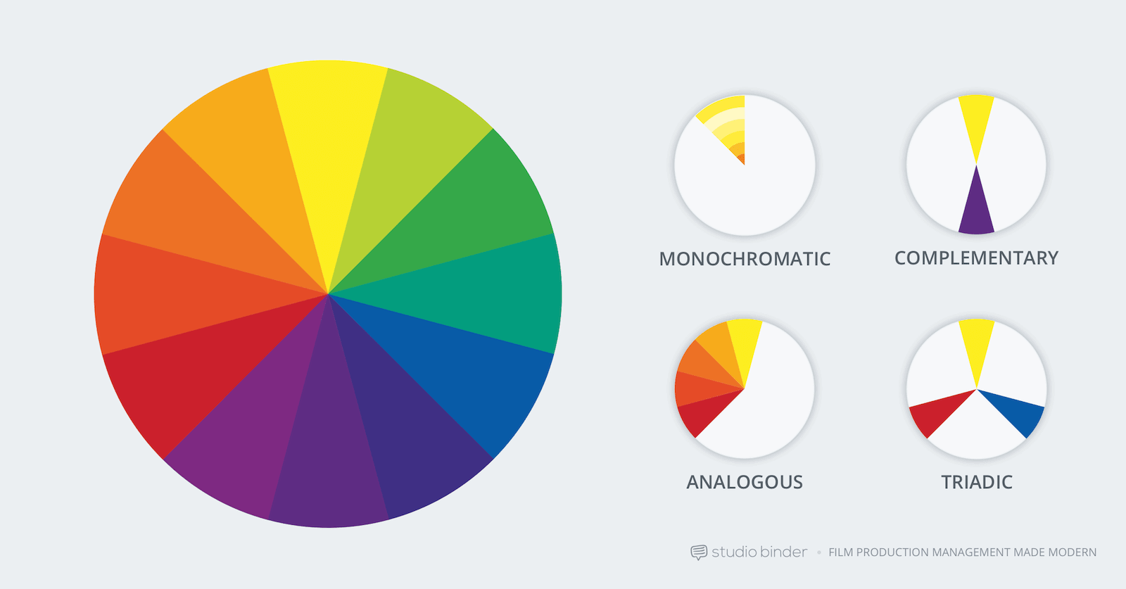
Therefore, it is important to use colour combinations that work well together and create the desired emotional reaction or experience. There isn’t an exact way to choose the right colours for your brand, however, it can generally be broken down into three groups.
1) Choose your primary colour
Which of your brand’s personality characteristics is the most important? Your base colour should not only reflect the most prominent characteristic of your brand identity but also appeal to the target audience you’re aiming to attract. The remaining colours will be chosen based on how well they complement this one.
Colour is quite subjective, yet it does generate an emotional response. What are your thoughts about yourself? If you’re lively and fun, bright, vibrant colours are anticipated. Muted tones will give off a serious and more sophisticated vibe.
2) Choose your secondary colours
The secondary colours you choose will be used the most after your base colour. This is a bit trickier than choosing your base colour because there are more restrictions: aside from matching a brand personality trait, your accent colour must also pair visually with your base colour, not to mention resonate with your audience.
3) Choose your neutral colours
Besides your written text, your neutral colour will most likely be a background colour, something chosen to avoid attention. Typically these are different hues of grey, but beige, whites and off-whites work, too. Black is also an option, but be careful; it tends to dominate any colour scheme it’s a part of.
